60-30-10 Color Guide For Salon Interior Design
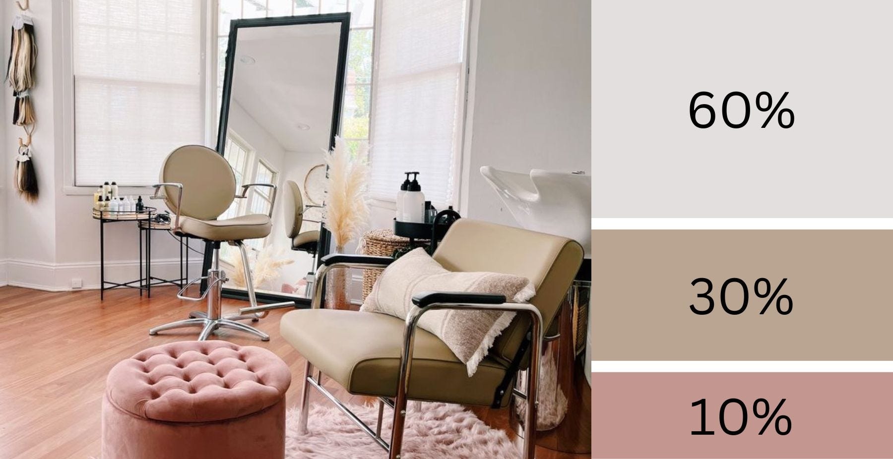
Interior spaces that are especially a part of wellness environments should present harmony, balance, and generally please the senses. In terms of design, pleasing the senses can be achieved through many design elements and principles. Color is an impactful element to play with to achieve that sense of sereneness.
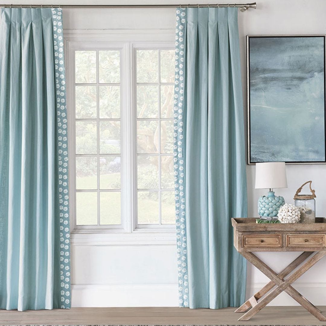 In this vignette, you see 3 colors used in delicate proportions to create a serene setup. When working with color, following a few parameters such as using three colors is effective in establishing order. If approached without parameters, color can offend the senses and create an atmosphere of stress.
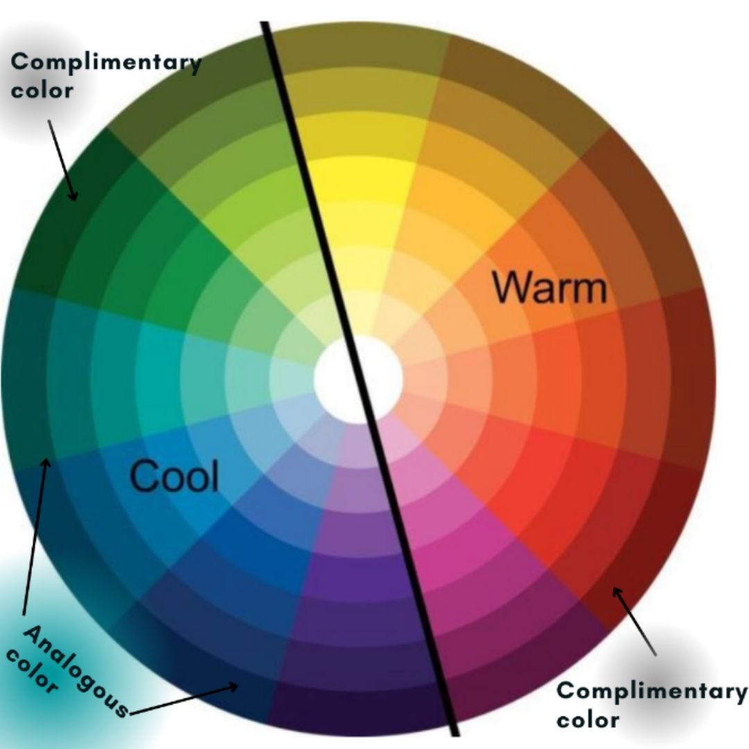
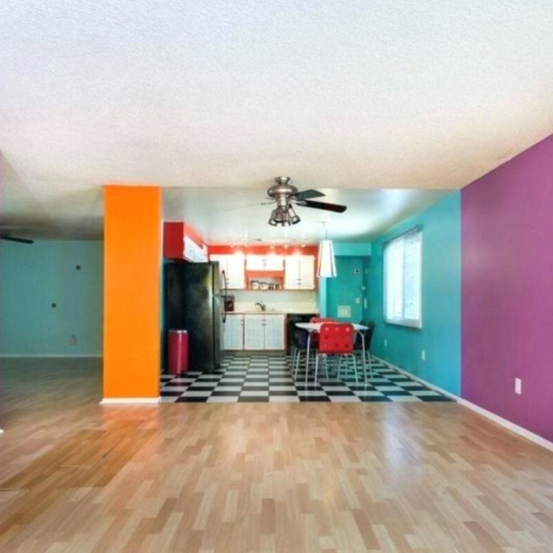 Take for example this kitchen living space: The walls have 4 different colors in this open plan. Color palette for interiors take cues from the color wheel as well as trends. Are the colors complimentary (opposite each other on the color wheel), or are they analogous (next to each other on the wheel)? These colors don’t follow any direction based on the color wheel. They are arbitrary.
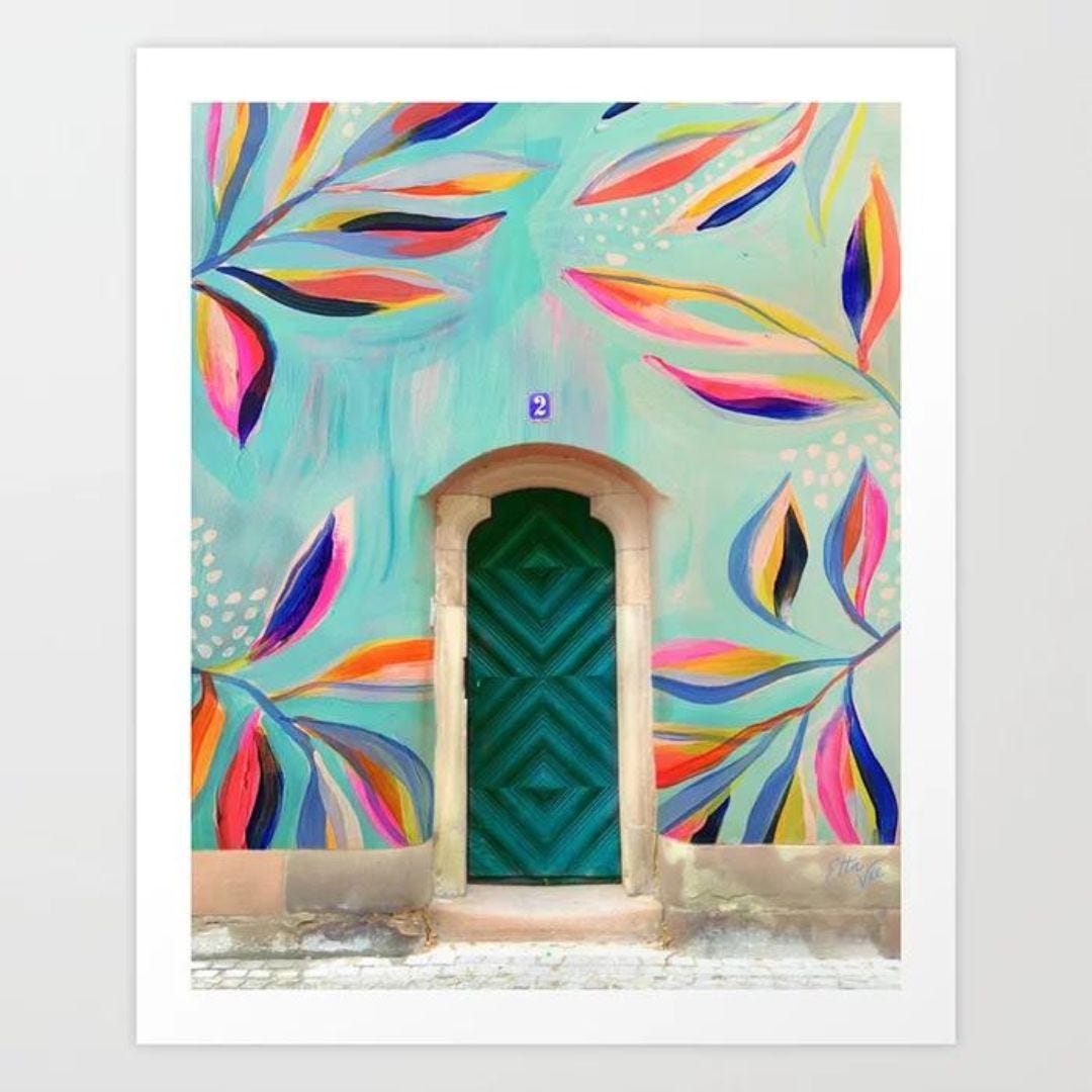
Here you see a photograph of a beautiful door that plays with complimentary colors. The various shades of turquoise are opposite the various shades Oranges. Since it is easy to get carried away with color, trying to create some order through color can be done by focusing on 3-4 colors that harmonize together by sticking to a specific ratio of quantity. There is the 60, 30, 10 rule where you pick a main color at 60%, a secondary color at 30% and an accent color (or colors) at 10%. This simple rule of thumb to land on a color palette for your environment not only provides balance, but helps instill harmony to successful salon and spa interiors.
Let's look to some of our clients' beautiful salons for evidence of the 60-30-10 color rule.
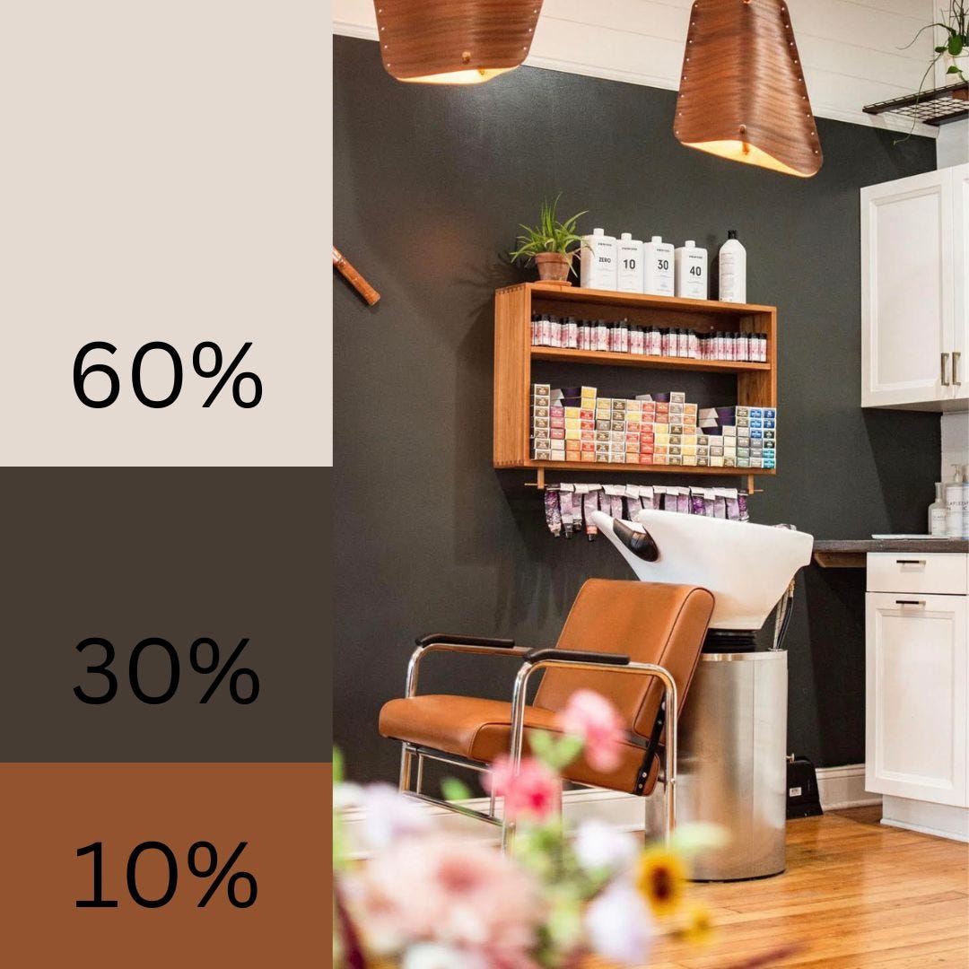 In the salon shampoo area shown above, the stand out three colors are dove white, slate gray, and warm camels. The ceilings, cabinetry and Montego Pedestal Brushed Nickel Shampoo System are degrees of white that take up about 60% of the color, whereas the accent wall is in a matte slate gray that takes 30% of the color. The lighting, product shelving, and Alluvia Auto Recline Shampoo Chair add the warm camel hue or woodsy colors to contribute the last 10%. This overall palette is grounding and pleasing.
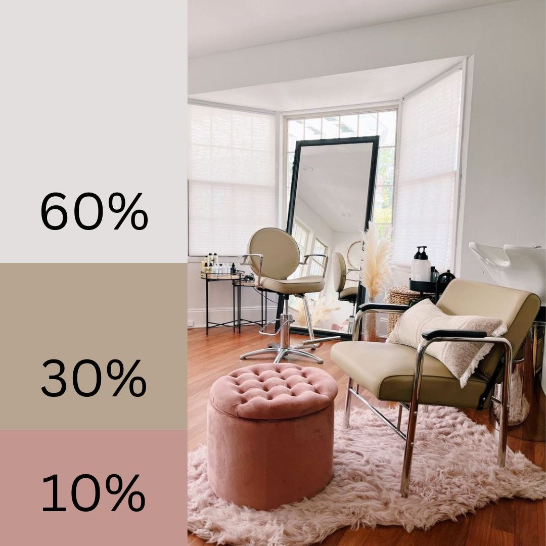 In this lux, cozy studio salon, the composition of elegance in color is achieved through grayish whites, mauve toned pinks, and an updated khaki’s cousin, cashmere. The walls, window coverings, architectural details and the Montego Pedestal Stainless Steel Shampoo System embrace the gray-white at 60% of the color. The Prado Salon Styling Chair and Alluvia Auto Recline Shampoo Chair are upholstered in a buttery cashmere vinyl supported with the same toned accent pillows and accessories rounding out at 30% of the color story. The shaggy rug and quilted ottoman are in a sophisticated mauve, filling in the 10% color portion of the palette.
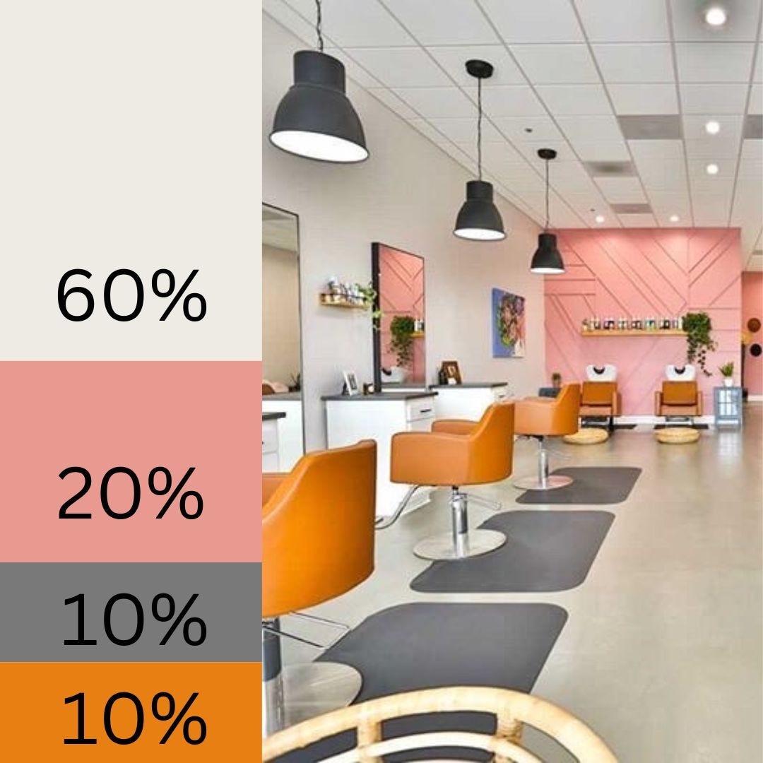 In this vibrant salon establishment, the coral accents jump out and get your attention. The neutral whites on the wall, ceiling and tinted concrete salon floor make up 60% of the design palette. The coral statement walls with branding compel attention at 20%. This design embraced more color by taking its accent of 10% and adorning the Venturi Salon Styling Chairs with round bases and the Avant Ultra Shampoo Systems in a camel finish. The anti-fatigue salon mats and pendant lights are in a slate gray to pair the accent colors in equal proportions.
Using the 60-30-10 color ratio rule, you can dial up your salon interior design on color. Selecting palettes that are complementary can create energy and excitement in a space. Selecting analogous colors can create serenity and harmony. Minerva’s wide selection of salon equipment available in a variety of styles, colors, and finishes can provide a nice source of hues to support your design palette and functions elevating the salon space as a whole.